Showing posts with label 4VC003. Show all posts

Tuesday, 14 February 2012

Semester One - Type Finalised

I have entered into the crazy whirl-wind of semester two, where for typography I have already done two tasks and started a main project.
As I came to update my blog with new work I realised I hadn't yet uploaded my final pieces from semester one.
So, here they are ...

 This is the final front cover - I am personally very happy with how it came out.
I used a simple typeface (Helvetica Neue) and tried to create a 'colour-scheme' even though it's in black and white. I purposely used the colours behind the articles in that order because that is the order in which the colours flow on the shark.
I added a barcode which I created myself just to add a bit more authenticity to it.

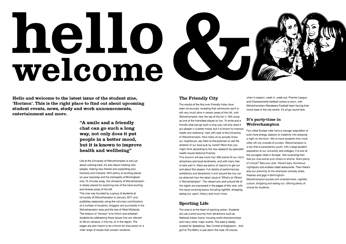
This is my final 'Hello and Welcome' page. I am also happy with how this turned out.
I think the spacing works extremely well and the hierarchy helps the reader to know what to read first and what is grouped together.
I originally had the ampersand touching the centre fold but last minute decided to move to over (to line up with the text). I did this because I didn't want it to get lost in the fold.
If I was to do it again I would probably/maybe change the size of the photograph.
This is my personal zine. I actually love this.
I think it fits the brief perfectly and it would appeal to the student audience (as it is an interesting article and the imagery has comedy factor to it).
The reason I put a black boarder around the page is because I wanted the illustrations to be coming out the edges (because if they came out the centre, it wouldn't have looked as good and would possibly get lost). We got told we needed to allow room for bleeding so I put the black boarder around so that it was planned/strategically placed. If I didn't put it on the illustrations could be cut or look like they were floating.
The only problem with my design is that the 'U' and 'H' and right in the centre fold and could potentially get lost.

Saturday, 10 December 2011

The Pressure Is On ...

These are photographs of some of the thumbnails I have drawn for the welcome page.


Once I took my photographs and put them on the computer I used them to help produce computer generated layouts on In Design.
These are print screens of how I placed the text on top of my thumbnails.


And this is what they look like without the photograph in the background.


This is an idea for my front cover ...


I am really pleased with how this turned out and I really like the shark idea, I might change the positioning of the text so that it doesn't overlap with the 'n'.
But I like how I've done the title.

Tuesday, 15 November 2011

'Zine' Part Two

Part two of the module is to produce a front cover and double page spread for the student zine 'Horizon'.
The double page spread part of this project seems easier than the first as the words were given to us.
I decided to try doing it straight on the computer so that I could move the text around on screen.

This was my first attempt but I thought it was a bit boring.
After getting feedback I realised that the body copy was too big at 12pt and that changing the size would create a lot of extra space.

I decided to make it look a bit more 'funky' so that it'd appeal to the student audience.
After a bit of tweaking and help I came up with this layout. I used the same typeface that Terry Jones uses as I really like his style.
I also added a few of my own photographs from uni nights out to make it more relate-able.

'Zine'

Our first brief for this module was to create a black and white double page spread with 250 words on about the Black Country.
I knew exactly what topic I was going to do as soon as I read the brief but I found the thumbnails extremely hard as I'd never done typography before but after a lot of research, books, and nagging tutors I finally started to feel comfortable and confident enough to produce something.
 My research was quite simple but that was all I felt I needed as my article was about what I personally thought about food in Wolverhampton.

This is my research page ... It contains menus and written information/personal opinions.

 This is my first layout page, I am not happy with this as I didn't know how to do thumbnail sketches so I just did some rough sketches of how the pages could look (like a menu).

I then had the idea of including illustrations and turning the layout into a V.S battle.

I decided it'd be easier to write my 250 words then do the designs because then I'd know how many paragraphs I had and how much text was in each.
My 250 words are:
Wolverhampton

Good Pub Grub

Don’t want to break the bank?
If you’re visiting Wolverhampton city centre for the first time, you’ll probably be bamboozled by the amount of places there are to eat. As a local and a student I have become aware of the places that I think are good value for money.

Hogshead
Hogshead is ideally located close to the university, but unlike the other pubs in close proximity, such as The Varsity and Royal London, Hogshead has a much less ‘studenty’ feel, which is not at all to it’s disadvantage. Lunchtime is packed full of people on work lunch breaks or watching the sport on the wide screen TVs benefiting from great value food and drinks. In addition to the already low cost food the menu boasts many offers, such as two main meals for £6.95, two for one on desserts and even drinks included in some prices. The best thing about it, Hogshead has embraced the student population and has introduced a student card, available for £2, but it only features seven offers that are mainly for drinks.

Walkabout
Unlike Hogshead, Walkabout has a buzzing student environment, playing music and big sports matches by day, turning into a club by night. Unfortunately it’s located way out near the bus depot, which is not very close to the university. Luckily, this is its only downside. Walkabout features a branch-wide ‘Boomerang Card’ offering a discount of 20% off the whole menu. The card is available to the general public for only £3 a year, a real bargain considering the food is originally great value for money so you can enjoy a quality lunch for very low prices.

 
I tried a scrabble board effect by linking the text but then noticed that Good Pub Grub and Wolverhampton both have 13 characters. I want to try and link the headings but with the text disappearing into a line.
If I do this I will need to manipulate the letters as they are all different widths ... Won't line up as well as hand drawn.

 Terry Jones, I-D Magazine, 1st August 1981.

Terry Jones, I-D Magazine, 30th June 2011.

Terry Jones, I-D Magazine, 30th June 2011.
I really like Terry Jones' work ... It is very punk and random. He uses a lot of typefaces and has work almost looks collaged (ripped up photos and placed cut out text).