Saturday 10 December 2011

The Pressure Is On ...

These are photographs of some of the thumbnails I have drawn for the welcome page.


Once I took my photographs and put them on the computer I used them to help produce computer generated layouts on In Design.
These are print screens of how I placed the text on top of my thumbnails.


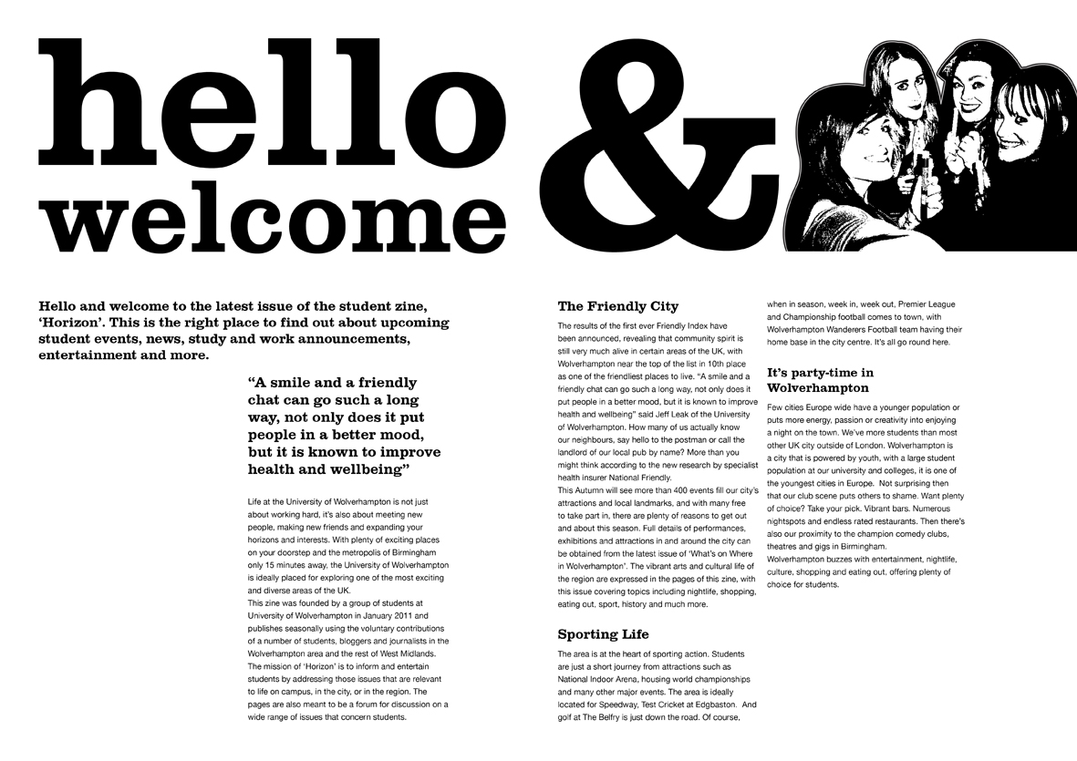
And this is what they look like without the photograph in the background.


This is an idea for my front cover ...


I am really pleased with how this turned out and I really like the shark idea, I might change the positioning of the text so that it doesn't overlap with the 'n'.
But I like how I've done the title.

Thursday 8 December 2011

Amnesty International Continued

After the feedback session I decided to change the headscarf and make her look more sad.
I added a tear so she looked like she was crying and I made the headscarf light to dark (gradient).
After changing the headscarf colour I also changed the shadow in the clothes from a block colour to a gradient to add more depth.

 After the group feedback session I also decided to continue the rock idea by using rocks to write '50'.
I gathered some little rocks out of my garden and placed them in the shape of 50 then photographed them and illustrated it.

 I then put it all together and added the text 'years of protecting human rights' but it's not the right text on the brief.

 So I re-did it with the right text but stretched it out a bit so it looked more like the amnesty international logo typeface.

 The text looked a bit too cramped so I made it slightly wider ... But then it looked like it did to begin with.

I finally changed the text so that it looked a bit more like the typeface on the logo.
I saved my illustrator file as a JPEG and inserted it into photoshop to put the logo on (so that I could invert the colour and delete the background).
I am going to use this as my final piece as I am very happy with how it turned out.
The only criticism I have been given about it is the fact that her legs aren't showing but I don't have enough time to change that. If I had more time or re-did the project I would add legs/calves and possibly shadow.

Sunday 4 December 2011

Letterforms

This doesn't necessarily use interesting letter forms, but I found the sign funny.

While stuck on the motorway I noticed a 'T' in the steamed window. I like the fact that the car lights are 'blurred'.

'H'

'B'

'Y'

'I'
'D'

I like how the label on this bottle is torn and only part of the writing is visible.

I love the look of the strongbow glass and how even though glass is transparent and writing still stands out.

'H'

'M'

'H'

'X'

This is a sign in the pub Walkabout ... I like that it's bold but informal.

'B'

'H'

'D'

'B'

'O'

'C'

'A'

'E'

Various letters.

'W'

'Z'

'O'

'L'

This is the poster on the bin in the baseroom.

Rubber letters.

I love this photograph ... The backward letters and the items in the background.


'I'

Either 'Y' or a 'W'

'A'

'T'

'S'

'O'

I found this sign interesting so took a photograph of it. I don't know whether I'd use it in my movie but I like the sign.